


In today’s digital landscape, where users access the internet through a myriad of devices – laptops, tablets, smartphones, and beyond – ensuring your website delivers an optimal experience across all screen sizes is no longer a luxury, it’s a necessity. This is where responsive web design (RWD) comes in.
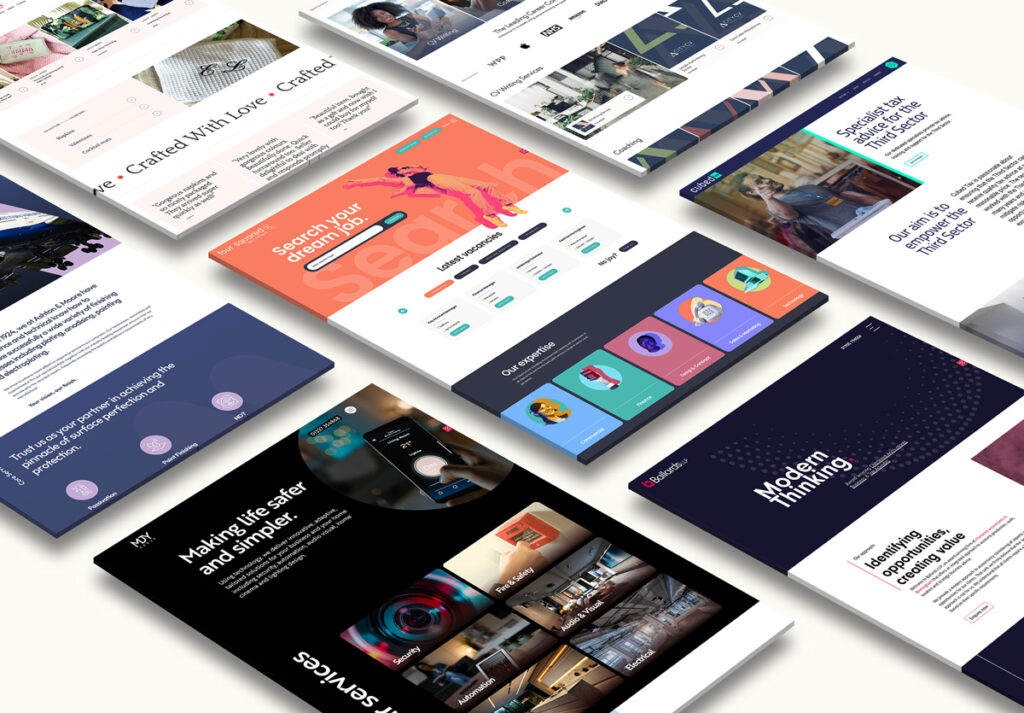
At CreativeFolks, we’re a passionate web design agency dedicated to crafting user-friendly websites that adapt seamlessly to any device. In this article, we’ll delve into the concept of responsive web design, explaining its core principles and highlighting why it’s crucial for your website’s success.
What is Responsive Web Design?
Responsive web design is a web development approach that ensures your website adjusts its layout and elements to fit the screen size of the device being used. This means a website built with RWD will display beautifully and function flawlessly on desktops, tablets, smartphones, and even smart TVs.
How Does Responsive Web Design Work?
- Flexible Layouts: Responsive websites utilise flexible grids and fluid layouts that can adapt to different screen widths.
- Media Queries: Media queries are lines of CSS code that instruct the website to adjust specific elements (images, text size, navigation menus) based on the screen size.
- Responsive Images: Images are optimised to resize automatically or display alternative versions depending on the device’s screen resolution.
Benefits of Responsive Web Design
The benefits of implementing responsive web design are multifaceted and impactful for your website’s success. Here are some key reasons why RWD is essential:
Enhanced User Experience
Users expect a seamless and frustration-free browsing experience regardless of their device. RWD ensures your website is easy to navigate, read, and interact with on any screen size. A positive user experience translates to longer engagement times and increased user satisfaction.
Reduced Maintenance
Maintaining separate websites for desktop and mobile can be cumbersome and time-consuming. RWD eliminates the need for multiple versions, streamlining website management and saving you resources.
Increased Conversion Rates
A website that adapts to any device creates a smoother user journey, ultimately leading to more conversions, whether it’s a purchase, a form submission, or a call to action.
Improved Search Engine Optimisation (SEO)
Search engines like Google prioritise mobile-friendly websites in search results. A responsive website demonstrates mobile-friendliness, potentially boosting your search ranking and organic traffic.
Increased Conversion Rates
A website that adapts to any device creates a smoother user journey, ultimately leading to more conversions, whether it’s a purchase, a form submission, or a call to action.
Future-Proofing Your Website
As technology continues to evolve and new devices emerge, a responsive website ensures your website remains accessible and functional for users regardless of the future landscape.
Responsive web design is no longer an optional add-on; it’s a fundamental aspect of modern web design. By investing in RWD, you’re creating a website that caters to your audience’s diverse needs, enhances their browsing experience, and positions your online presence for long-term success.
Ready to build a user-centric website that thrives across all devices? CreativeFolks can help! Our team of experienced web designers can craft a responsive website that’s not only visually stunning but also optimised for all screen sizes and user journeys.
If you are looking to upgrade your web design, then get in touch with us at CreativeFolks. We can help you elevate your brands website with full responsive web design. Contact us on 01604 420 430, or send us a message via our contact page.

